|
|
“There’s a consciousness underlying everything that has qualities, all positive.”
|
|
| | 

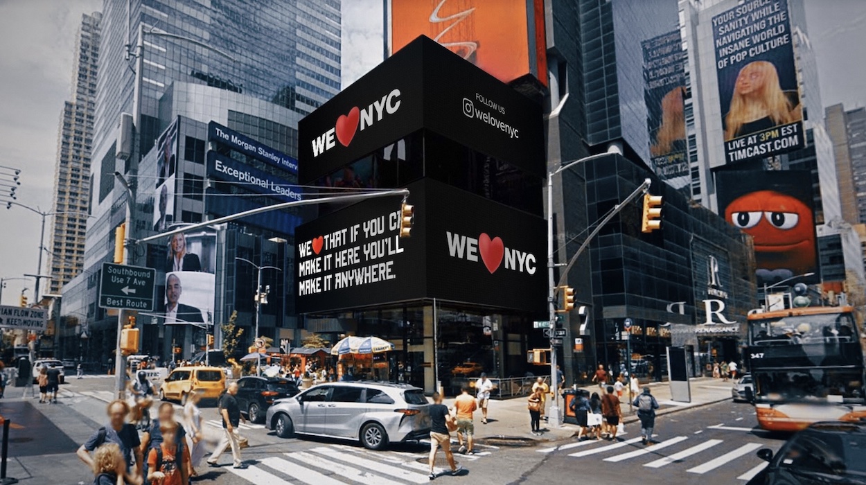
| New Yorkers Hate the We ❤️ NYC Logo
|
| What’s Happening: A consortium of business executives and New York City officials attempted to modernize Milton Glaser’s iconic I ❤️ NY logo, drawing ire from locals whose main critique is to simply not mess with perfection.
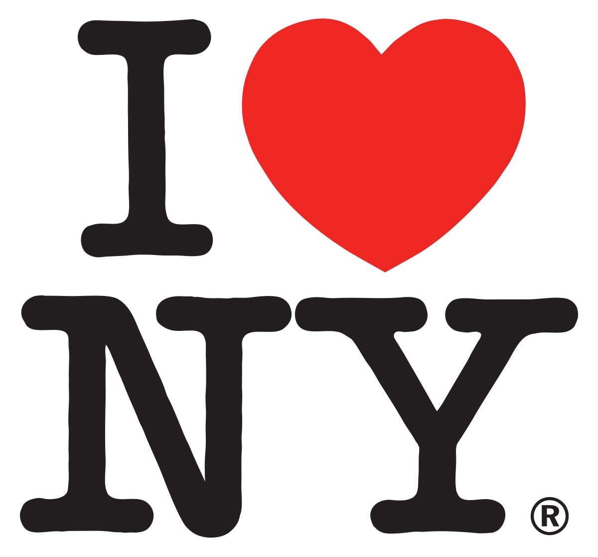
The Download: In the late 1970s, New York had reached a nadir. The city had barely scraped through a major fiscal crisis. A widespread blackout provoked looting and arson. Son of Sam loomed large. The Bronx was burning. Amid the chaos, Milton Glaser sat in the back of a taxi and sketched what would become the I ❤️ NY logo after being commissioned for a tourism campaign. The late graphic designer loved New York so much that he gave the logo to the city for free, hoping it would become public property.
Glaser’s napkin doodle has since become inextricably linked with New York City’s identity, its Robert Indiana–like foursquare arrangement etched into our psyche thanks to souvenir shops emblazoning the logo on everything from T-shirts and mugs to teddy bears and G-strings, not to mention spawning countless imitations around the world. In a 2018 interview with Surface, Glaser described it as “the most successful thing I ever did. It reflected a certain desire in our population, something people wanted to express. They wanted to say, ‘I don’t want to move out. I love New York.’ It wasn’t a logo. It was a cry for acknowledgement.”
| |
Partnership for New York City, a consortium of business executives, corporations, and elected officials, had started drawing parallels between the late 1970s and today. (Both can be viewed as watershed moments as the city rebounded from divisiveness and economic woes.) To help promote their latest campaign that encourages locals to “fix what they see as broken in the city,” as president Kathryn Wilde notes, they decided to modernize Glaser’s logo to reflect the current times. That entailed swapping in a protruding heart emoji and replacing his typewriter doodles for sans serif caps referencing Helvetica, the font on New York City subway signage.
Helvetica, it turns out, also graces the city’s garbage trucks. And according to the scores of New Yorkers who took to Twitter to share their shock, anger, and confusion at the campaign, that’s exactly where the logo belongs. “Don’t mess with perfection” was the consensus, but to say the design was skewered is putting it nicely. Some thought it could have been made in Microsoft Paint; others questioned its readability, pointing out the text could easily be interpreted as “We NYC ❤️.” Ben Stephens, a freelance copywriter, described it as “lopsided and incoherent,” likening its voice to that of “an investment bank or possibly a healthcare provider.”
| |
That’s where the new campaign falls short. Glaser’s logo came about serendipitously, a spur-of-the-moment flash of genius whose simplicity speaks for itself. Partnership for New York City spent upwards of a year finessing their concept, and while the underlying message is one most locals could heed, the “marketing try-hardism” is hard to ignore. As Elissaveta M. Brandon writes for Fast Company, “replacing Glaser’s logo with a beating-heart emoji seems more heartless than helpful.”
In Their Own Words: “We’re hopefully going to be able to cut through divisiveness and negativity,” says Wilde, who cited surveys her group conducted during the pandemic. “People in New York want to be part of fixing what they see as broken in the city.”
| |
|
|
| What Else Is Happening?
|
| | | | |  |
Ai Weiwei’s London show will feature a giant Lego recreation of Monet’s Water Lilies.
|
| | |
|
|
Reach the design world every morning. Find out more about advertising in the Design Dispatch.
|
|
| | 
| Designing Delicious: MILA Omakase
|
| Designing Delicious is produced in partnership with Dorsia, a members-only platform with access to reservations at the most in-demand restaurants in New York, Miami, and L.A.
Part of a trio of new concepts recently unveiled by Miami’s hit MediterrAsian spot MILA, including a private members club and an intimate lounge, decorated chef Michael Michaelidis—who trained under Joël Robuchon and has 26 Michelin stars to his name—and executive chef Reiji Yoshizawa put on quite a show at MILA Omakase.
Immersed in a transportive atmosphere complete with a sweeping cherry blossom tree, a Japanese-inspired wallpaper screen, and a 500-year-old hinoki wood cutting board, a nightly gastronomic journey awaits patrons lucky enough to score one of the ten seats. “We want to really reach the art of fine dining,” says Michaelidis, referencing the tweezer-driven precision of the plating and the elegant fusion of Mediterranean and Japanese influences.
The heart of this exclusive experience lies in the ever-changing menu, which evolves in harmony with the 72 Japanese micro-seasons. Line-caught fish is flown in daily, including Hokkaido sea urchin, sustainable bluefin tuna from Baja, and Sanuki Olive Wagyu from Japan’s Kagawa Prefecture. In the capable hands of Michaelidis and Yoshizawa, the exquisite ingredients are transformed into dazzling compositions worthy of the revered tradition of omakase, a phrase that translates to “I leave it up to you.”
| |
|
| | 
| Platform and Rose Wylie Team Up on Slick Streetwear
|
|
In Rose Wylie: Which One, a recent monograph published by David Zwirner Books, the British painter’s oeuvre is brilliantly described as a “union of high and low culture.” She pulls inspiration from sources as varied as the news, film, pop culture, and fashion history. In her latest collaboration with art marketplace Platform, Wylie’s works could become part of fashion history itself.
On April 4, Platform will release a 150-count drop of hoodies featuring Wylie’s skeletal painting Black Cat (Bones) (Study). According to Platform founder Bettina Huang, the collaboration stemmed from Wylie’s longtime desire to make an “ugly” hoodie. Admittedly, its flattering taupe hue and goth-cool screenprint veer more into streetwear and skater style, but we’re not complaining.
| |
|
| |

| Extended Family: DuVernay & Friends
|
| When: Until April 28
Where: The Gallery at Ace Hotel Brooklyn
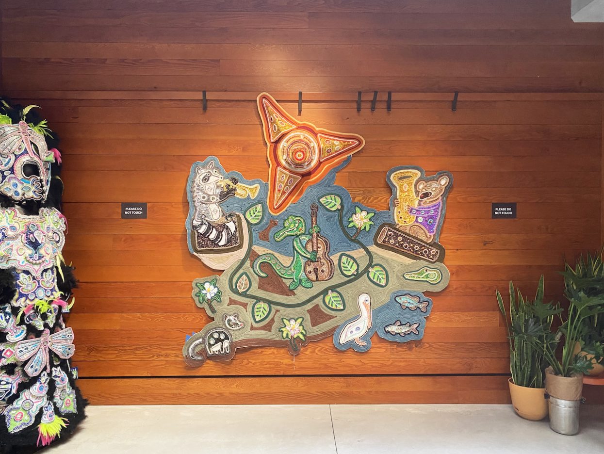
What: Many think of the most famous celebration in New Orleans as an occasion to booze and bead-throw, but the Mardi Gras Indians—a group composed of different “tribes” of Black residents, many of Creole descent—take the festivities seriously. Months in advance, they’re hard at work hand-making ceremonial garments for a spectacular carnival event where each member dons flamboyant homemade suits that nod to Native American dress.
After showing at Guilt By Association this past fall, the Duvernay Collective and Friends—a New Orleans group whose members hail from various Mardi Gras Indian tribes—are bringing more of their creations back to the gallery and the nearby Ace Hotel Brooklyn’s lobby. A dazzling hand-beaded tapestry depicting flora and fauna from the Louisiana swampland anchors the setup, which also features like-minded tapestries by artists Big Chief Pie and Big Queen Denise. “Our desire is to extend the artistic practice by giving our work a second life,” DuVernay says, “and making this heritage contemporary.”
| |
|
| |
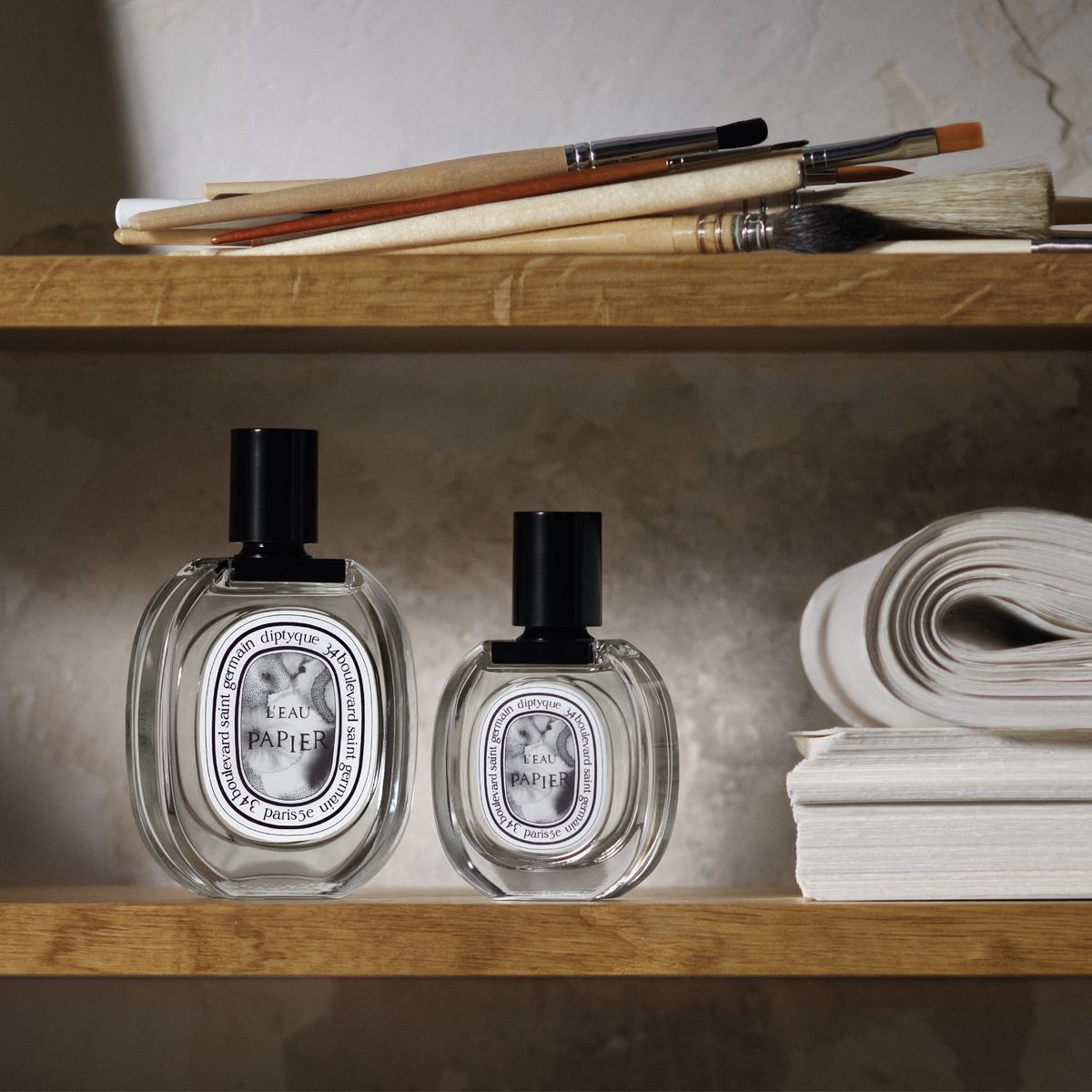
| Diptyque’s New Scent Evokes Ink on Paper
|
|
We may be living in an age of voice notes, but ink and paper inspired L’Eau Papier, the latest olfactory offering from Diptyque. A healthy spritz of storytelling, too: “Creating a perfume for Diptyque is like writing a book,” says perfumer Fabrice Pellegrin, the nose behind many of the French maison’s greatest hits. “You have to have a story, an introduction, a structure.”
So for L’Eau Papier, he started with top notes of roasted sesame seeds before enhancing them with floral mimosa and powdery properties that evoke the fresh scent of ink on paper—“a subtle, sensitive interaction,” he says. The result is light fragrance whose powerful undertones sneak up on you over time, much like a novel’s dramatic denouement.
|
|
| | 
| ICYMI: Jace Clayton Interweaves Sound, Memory, and Space
|
|
Humans gather in song. One history of architecture and design can be told through our designing of spaces to do it, from ancient clearings for drum circles to churches and nightclubs. In 2001, the DJ and writer Jace Clayton gathered with others at New York’s PS1 for Janet Cardiff’s The Forty-Part Motet, a sound installation for which she recorded each individual of a choir performing Thomas Tallis’s 1575 choral work Spem in Alium Nunquam Habui. Cardiff set up a circle of speakers and assigned a singer’s recording to each one. “It was gorgeous,” Clayton tells Surface. “But it required the subtraction of bodies. It was about recording technology. What if I created a scenario in which bodies are required?”
This spring, Clayton’s thinking substantiates into They Are Part, featuring 40 Part Part, a circular installation of 40 speakers within the vast second floor of Boston’s MassArt Art Museum. Two benches beckon visitors to enter the circle; in the center, a plinth offers a directive: “Connect your device.” When that happens, audio makes its way through software housed inside in the plinth, out the speakers, and into the air. 40 Part Part remixes the audio input into shimmering, oscillating waves crashing upon the museum walls. It recasts visitors as collaborators. And it rethinks Cardiff’s spiritual sampling into active music- and world-making.
| |
|
| |
| Member Spotlight: Gantri
|
| Gantri is an award-winning digital manufacturer of designer lights. The company’s pioneering design and manufacturing technologies make high-end design attainable and sustainable. Gantri offers a diverse collection of modern lights by leading global designers and made-to-order in California using a proprietary 3D printing process and plant-based materials.
| Surface Says: With a roster of independent designers from around the world and a petrochemical-free 3-D printing process, Gantri is the lighting solution for a new generation.
| |
|
|
| Today’s Attractive Distractions
|
| |
|
|
|